A workshop flyer design for Casa Panot Creative Hub in Barcelona for St. Jordi Day. A day of romantic and cultural celebration in Catalonia where people traditionally exchange books and roses. Men usually gives women roses, and women gives men book, nowadays both gifts are exchanged more equally.
This redesign of Cecü’nün Yer Cüceleri focuses on capturing the book’s whimsical and imaginative tone through hand-drawn illustrations and a soft, watercolor-inspired palette. I created a custom typeface based on my own handwriting to add a personal, organic feel that complements the story’s playful spirit. The composition highlights the cosmic setting with floating planetary elements and textured visuals, aiming to spark curiosity and wonder at first glance.
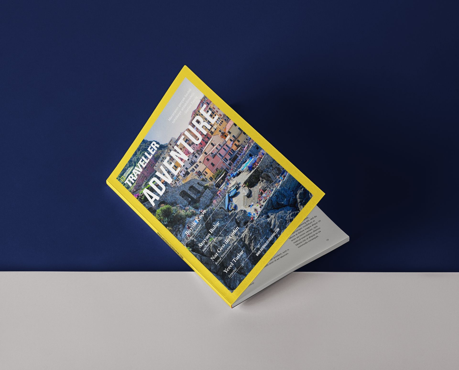
A conceptual redesign of National Geographic Traveller, focusing on staying true to the brand’s visual identity while giving it a refreshed, contemporary layout. The project explores hierarchy, typography, and editorial flow, using bold photography and the signature yellow frame to maintain authenticity and recognizability.
Poster design for the 6th İzmir Typography Biennial. The concept plays with maze-like linework and layered typography to represent the complexity and interconnectedness of typographic expression. A strong color contrast and structured layout make it visually impactful and suitable for both print and digital promotion.
A travel brochure designed for Pegasus Airlines, created from concept to production. All visuals—including the mockup—are original: I folded an A4 paper by hand, photographed it, and digitally placed my layout using real brand assets and colors. The design focuses on clarity, promotional effectiveness, and on-brand visual storytelling.
A curated social media identity that showcases my personal and experimental creative work—from sketchbook pages and collage reels to brand design. The layout highlights different visual styles while maintaining a consistent tone and playful energy that reflects my artistic exploration outside of commercial work.
This calendar design is based on my personal perception of each month's color and seasonal atmosphere. Each block reflects how I experience time visually—through tone, mood, and weather—resulting in a vibrant and intuitive layout. The clean structure is paired with bold, expressive color choices to create a visually engaging yet functional piece.